Friday, 26 June 2015

Art Class - Not quite fifty shades of green!

Puddle Duck Pond

This painting in acrylic was influenced by the Jungle paintings of Henri Rousseau, last weeks artist to research.  We had spent half an hour mixing as many different greens as we could with our own paints and this proved very useful as a reference when I came to paint my picture. Not quite fifty shades! We have a large natural pond in our garden and this is based on a photograph I took. Rousseau added exotic animals to his paintings so I thought I would add a Moorhen. Not really exotic but I thought the colours of the bird worked well with the painting.  We do have a resident pair nesting in the reeds but they are very shy so I resorted to Jeremy's bird books so that I could add one in. Some bits of the painting are better than others.  I spent a lot of time on the large leaves at the front and they are more detailed than others.

Lesley x

Saturday, 20 June 2015

Art Class - Oil Pastel

Overlooking the Wensum
The original sketch for this was done after watching a DVD on Manet, who often drew his friends in his paintings.  This is Mike sitting at a Wensum Lodge Cafe table sketching the opposite view to me. The following week we scaled up our sketches and as I had been experimenting with oil pastels at home I decided to use these. It was a lot harder than I thought especially where I needed detail.  I think the only bit I really like is the trees. Poor Mike has aged at least ten years.

Lesley x

Sunday, 14 June 2015

Art Class - Two versions of Van Gogh's Sunflowers

Sgraffito Sunflowers


 No Art class as it was half-term. Thought I would keep in practice by copying one of Van Gogh's Sunflowers using acrylic and trying to mix my own colours to match the colours of the reproduction.  Tried to get the effect of the brush strokes by using a gel medium but found this quite difficult with the brushes. Might try the medium another time with palette knives. Finished acrylic painting below.


My copy

For my sgraffito Sunflowers I used oil pastels put down in blocks of random colours, covered this  in black oil pastel and then scratched the design using an old kitchen knife.  In future I will use Indian ink on the top instead of black oil pastel as this version turned out to be quite messy to do.  The Indian ink method seems to seal in the oil pastel so you don't end up covered in black. I wanted the background colours to be random rather than laying down the colours for the flowers etc because I was aiming for a decorative design, doodling in patterns for the flowers heads. 

Lesley x


Monday, 1 June 2015

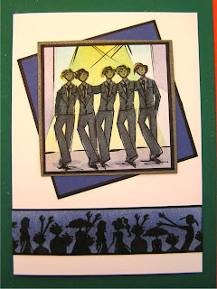
Clarity Stamp Challenge - Boys Boys Boys


Another month has flown by and it's time for another design for the ClarityStamp Challenge. This month the theme is Boys Boys Boys.

As usual I have worked on several variations at the same time so the photos don't always tally with the finished card, but I hope you will get some idea of the method used. I chose to use the black/white, simpler version as it shows the stamps better although it turned out more Riverdance than the intended Boy Band. 

Stamps: Clarity Characters set, Letterbox Set
Inks:      Adirondack Pitch Black, Jet Black Archival
Other:   Clarity Coated/Silk Card, Stencil brushes, black pen, 

Monochrome version (above)

  • Stamp Douglas several times on Clarity Card, some at slight angles. I used first generation ink to get the silhouette really dark, take care not to slip when stamping on silky card.
  • Stamp the rest of the crowd below, don't worry about overlapping.
  • Create spotlights by using copier paper to mask off in stages and brush very lightly with black ink. Add the stage line with a black pigment liner.
  • Cut out, edge with black pen, mount on silver then black card before sticking to white card.
  • Stamp 'Boyz' three times, using the Letterbox set,  onto white card, cut out, edge in black and stick onto card.  (I probably should have done this with masking but I didn't think that far ahead when I started.)


Thought you might like to see some other versions on the same theme.

Version 2

 Ingredients much the same except I used Theuva card, various colour Adironacks and Promarkers for colouring. Green is just backing paper for the photo.


Stamp Douglas as before but this time "2nd" generation ink. You don't want it too dark because you are going to colour over it. 


Using a black pen roughly draw on the outline of suits etc.  Add some arms and colour these in with a grey Promarker.  


Colour in with Promarkers. Promarkers affect the stamped images slightly. I used this effect to lighten the faces.
Create the spotlights and background as before, this time with Butterscotch, Stream and Egg Plant inks with a few black lines added. Cut out and mount on silver card.


For this version I created the crowd on a different piece of card and brushed on Denim ink to match the backing card before mounting below the Boyz.


Version 3
This one is a combination of version 1 and 2.

Looking forward to seeing all your entries this month and hope I have given you some inspiration.

Lesley x