Sunday, 13 December 2015

Art Class - Mono-print Christmas cards


During the last three weeks of term we have been having a go at mono-printing.  I was able to take in my Gelli-plate and use that rather than the acetate sheets that the others in the class had to use.  Using acrylics rather than printing inks meant that my prints dried almost instantly.  This was good for some effects but others, like drawing into the ink didn't work too well.  The aim was to make some prints that could be used for Christmas cards.  For most of the cards I have made, I took photographs of the original prints and resized on the computer before printing out.  This meant I could work into them with colours pencils, add glitter etc without spoiling the original print.  We had great fun doing the printing and it was so interesting seeing how different people's cards turned out. It is difficult to remember exactly how the prints were achieved but I will try to give brief outline instructions for some of the cards I made.

Card above (my favourite)
  1. Roll blue and yellow ink onto the plate. 
  2. Mix a bit but not so much that you just get a plain green
  3. Place fern leaves on the plate and blot with copier paper
  4. Quickly remove the leaves and take another print
  5. When print is dry add blues with Spectrum Noir colouring pencils
  6. Stamp on the deers (Claritystamps)
  7. Add some glitter glue.


  • As 1-3 above with the addition of some sequin waste over the ivy leaves. More blue than yellow paint this time
  • Emphasize greens on ivy leaves with pencils
  • Add glitter.
  • Backing paper is also a mono-print


  • This one was the first (scrap!) print of a fern leaf on copier paper. (step2 above)
  • It left a blank space where the leaf was and I drew the tree into it with a black pen
  • Add a horizon with the pencils
  • Stamp the deer and sentiment 
  • Add glitter of course.

  • I think for this one I took a print of ivy leaves as step 2 above
  • Let this dry then printed on top with the leaves in different positions
  • Enhanced edges with pencils and glitter on some of the leaves

  • Photo not very good as this one was printed on glossy card and the flash bounced off it
  • Another version of ivy leaves and sequin waste

  • These three were all printed in the same way but decorated differently afterwards
  • I made a foam stamp Christmas tree and pressed this onto the paint on the plate.  (Kids foam sheets from Hobbycraft)
  • Remove the stamp and take a print.
  • These were quick to do and the correct size for my cards so I just decorated the original prints.

Really had fun and it was a quick way to produce some original Christmas cards. Art class is over for this term.  Best wishes for a speedy recovery to Diana, my Art tutor.

Lesley x

PS. Does anyone know how to get three pictures together on one line?


Monday, 7 December 2015

Balloon Pop-up Card


Inside of card

This is a card I made for my grandson Forrest's first birthday in November. This is the inside of the card and it is a 3D pop-up (which doesn't show very well in the photo).  Sorry no step-by-step photos for this one.

Dies:      Card Scallop 3D(Pop-up) by Sizzix, Large Die Balloons by XCut, 
Stamps:  Happy Birthday Wooden stamp by Anitas, Letterbox kit by Claritystamp
Ink:        Versamark, Archival Black
Other:     Embossing Powders various colours, Background papers


  • Stick background papers inside card.
  • Die cut pop-up frame and balloons in various colour card.
  • Attach pop-up frame to the inside of the card with strong glue. I used the strong red double sided sticky tape for this.
  • Stick a thread to back of the balloons before attaching them to the top tab of the pop-up.  .  
  • Draw 1 on a balloon and stick to the background paper.
  • Using the Letterbox kit, stamp birthday name onto card, cut out and stick to the bottom tab of the pop-up.
  • Add a strip of matching red with 'happy birthday' stamped onto it at the base.  Not sure of the make of this stamp.
Front of card
  • I kept the front of the card very simple.  Stamped 'Happy Birthday' block stamp in Versamark and sprinkled with various coloured embossing powders before heat embossing. The spare powders can go back into a little pot for a new mix of colour.
  • Edge with a Sharpie pen and then mount on red card also edged with black pen.

This was a bit of a change in style for me, but I don't have many stamps suitable for young children's birthday cards. Creating the pop-up was quite fun and really easy using the Pop-up die.


Lesley x


Tuesday, 1 December 2015

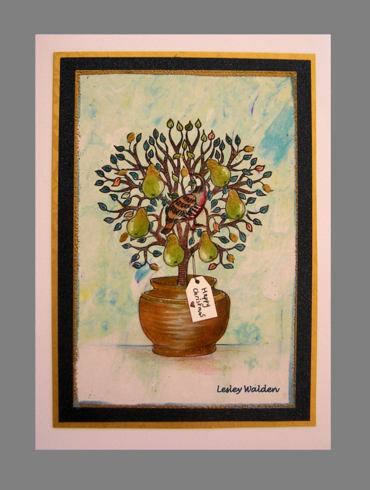
Claritystamp Challenge - A Christmas Story


This month's challenge is 'A Christmas Story' .  I'm sure many of you have already made this year's cards but I am way behind so I thought I would go for a design that didn't take too long to make.

Stamps: Claritystamp Pear Tree and Small partridge.
Stencil:  Claritystamp NDSC13 Various Pots
Ink:       Archival Black, Adirondack Stream, Butterscotch and Cranberry
Other:    Versmark pen, Gold embossing powder, Black pen, Colouring pencils and pens


  • My background paper for this is a shaving foam offcut from my box of 'might be useful someday'
  • Make masks for the small partridge, pears (drawn freehand) and the pot (using the stencil) on sticky-notes.
  • On background paper stamp the partridge using Black Archival ink and cover with it's mask.
  • Draw the outline of the pot using the stencil and a black pen and then cover with it's mask.
  • Position your pear masks wherever you want them.


Apologies for the blurry image.

  • Stamp the Pear Tree using Black Archival ink and then remove the masks.
  • Draw in the pears and the back of the pot with black pen.

  • Place stencil back over pot and using a makeup sponge add colour using Adirondack Stream, Butterscotch and Cranberry.
  • Colour in the leaves, pears and Partridge using whatever you prefer. I used some waterbased pens with a fine nib for the leaves and the brush end for the pears. A touch of white pen for the highlights.
  • Add some more shading to the pot with colouring pencils.

  • Trim and edge.  I first went round the edge with an alcohol pen but this didn't work very well on the shaving foam.  To retrieve this I went over it with a Versamark pen and added gold embossing powder and heat set this.
  • With the embossing powder out, I couldn't resist adding gold to a few leaves, a tiny bit on the pears and the stripe on the pot.
  • Add the impression of a table with pencils to ground the pot.
  • Mount on blue and gold card before attaching to card blank.
  • Final touch. Add a small tag made from a scrap of card. Write on 'Happy Christmas' message. Draw string with pen.

Hope you like my design and feel inspired to have a go at the Claritystamp Challenge yourself. 


Lesley x

PS
I tried this design again without the shaving foam background to give a cleaner image. It was even quicker now that I have all the masks cut out. Glitter glue instead of gold embossing.  I like this version better.


Thursday, 26 November 2015

Art Class - Half term homework


Prince and his Tutor

We have been doing life drawing, a first for me, and I'm not sure what the rules are on sharing life drawings without asking the sitter's permission, so I thought I would post my homework instead. The task was to enlarge and interpret a black and white photocopy of part of a painting by Gerrrit Dou in our own colours. I have tried portraits before in acrylic but they weren't very successful so for this I chose soft pastels for a change.  I found getting the detail difficult with the pastel sticks, even using a blender tool, so there is a bit of graphite pencil work on the eyes.  This did not photograph very well as the light bounced off it.  If anyone knows how to do details with soft pastel I would love to hear from you.

Lesley x

Thursday, 19 November 2015

Art Class - Roman pots version 3


This is the painting I had in my head when I took the photograph back in September.  It is painted in acrylic on a paper with a slight texture. By using lots of dry brushing the texture of the paper breaks up the colour creating the effect I wanted on the pots.  I have used colours that are much brighter than the original pots. Thought you might like to see the other versions together with the photograph. 


I would welcome your comments and perhaps you could let me know which version you prefer. 

Lesley x


Saturday, 14 November 2015

Art Class - Zentangle Pots


This is another version of my Roman pots that I posted on 4th November.  I printed a small copy, about 5" by 7", of my Patrick Caulfield pots for my sketchbook. I traced the outlines of the pots onto some cartridge paper and then just doodled inside them with a black pen. This is quite relaxing and doesn't take very long, unless you are a perfectionist.  I did do another version that I coloured in but I prefer this monochrome one. I have also made a start at painting my original enlargement of the photo, which I will post when finished.

Lesley x

Thursday, 12 November 2015

Art Class - Impressionist Chrysanthemums

Still life
Another still-life, this time incorporating a 2D picture (front of the book) with 3D objects.  Not over enthused by the topic this week but thought I would try to paint in an impressionist way to keep in the style of the painting on the front of the book.  I am quite pleased with the flowers but still have trouble with my greens ending up too bright, even though I mix the colours rather than using green from a tube. This is painted in Acrylic with a bit of white pen work for the text.

Lesley x